RedColor TheoryCommanding Red: Balance and Relativity
Color Scheme - 2025 -
While red is often associated with passion, its tone dictates its essence—it can radiate pure energy or emphasize negative elements like agitation and danger.
Red is frequently adopted as a corporate color for major global brands. In my role evaluating how renowned design firms handle this hue, I have noticed a recent struggle, perhaps due to the talent shortage in the DX boom. Often, the execution is too 'dense,' making the screen feel heavy and lacking in overall sophistication. When the power to focus attention is weak, conversion performance falters, and brand recognition fails to advance.
On this page, let us explore the multifaceted characteristics of red and the diverse influences it commands.
Wavelength Range
| Color | Wavelength |
|---|---|
| Purple | 380–450 nm |
| Blue | 450–495 nm |
| Green | 495–570 nm |
| Yellow | 570–590 nm |
| Orange | 590–620 nm |
| Red | 620–750 nm |
Within the overall spectrum, the range recognized as 'red' is extensive; therefore, understanding the characteristics that emerge from subtle shifts in tone is essential. Deep, saturated reds embody a state of sophistication, while brighter tones radiate greater energy at the cost of reduced dominance within the hierarchy.
The Psychological Attributes of Red
| Positive | Passion, Love, Warmth, Vitality, Excitement, Strength, Stimulation, Materiality, Courage |
|---|---|
| Negative | Anger, Defiance, Aggression, Danger |
Passion, when excessive, can inevitably ignite anger and defiance. It is vital to remember that the functions of red, much like human emotions, are fluid and ever-shifting.
Red in Masterpieces: The Case of Max Beckmann
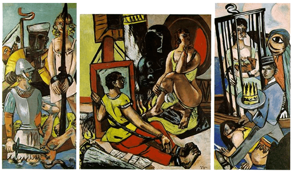
Triptych of the Temptation of St. Anthony - 1937 -
In this work by Max Beckmann, a leading figure of German Expressionism, he strategically deploys a deep, ominous red in localized areas to leave a powerful, haunting impression. The red used here is not merely decorative; it is a "dominant red" that commands the composition, exerting a profound sense of authority and premonition.
Red in Masterpieces: The Case of Henri Matisse
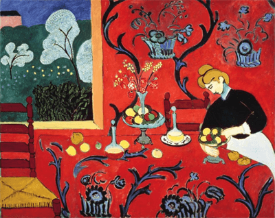
Harmony in Red - 1908 -
In this renowned work by Matisse, a relatively light red blankets the entire composition, true to its title. Chromatically, this red functions as a gradual progression following the lemon yellow and the orange of the window frame. Here, the red seems to prioritize harmony with the whole rather than individual dominance; it is a resonance achieved at a staggering level. Furthermore, the brown tones used in elements like the chair frames significantly enhance the functionality of this light red, grounding the vibrant expanse.
Red in Masterpieces: The Case of Henri Matisse No.2
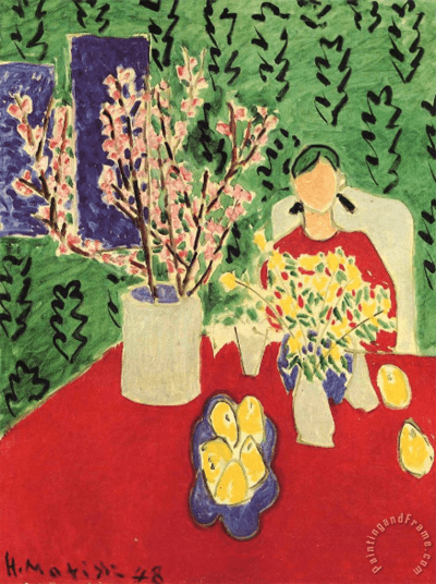
Plum Blossoms, Green Background Henri Matisse- 1948 -
Matisse often used red as a dominant force on his canvases. Even forty years after his masterpiece Harmony in Red, his affection for the hue remained unchanged, painting with a raw, child-like spontaneity. Is there any other red that feels so remarkably cool and serene? Though he was said to be lost in deep contemplation during his final years, his works continue to embolden and inspire creators to this day.
Appendix: AI and the Artistic Expression of Red
Even when using AI prompts, one must devise a style capable of matching the inherent brilliance and intensity of red. What is your approach? Take Matisse’s final work mentioned earlier: a red so pure and fierce. Yet, there is an element that absorbs that overflowing power. Yes—it is green. The harmony is achieved through the resonance of these complementary colors. Once the palette is set, all that remains is to define the theme and composition. This is the true joy of design and art.
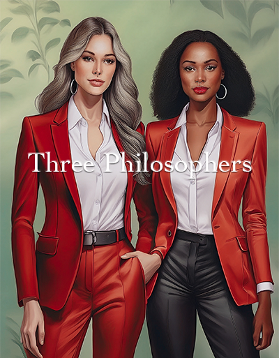
AI-Generated ArtWork - Prompted by
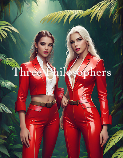
AI-Generated ArtWork - Prompted by
Epilogue: Mastering Balance and Relativity
I previously touched upon the work of major design firms. The reason output quality often falters is quite simply a lack of deep learning. Without considering overall balance and relativity—or by designing with an overly eager, "forward-leaning" mindset—the true functional power of red will never be activated.
Re-examining Max Beckmann’s work offers a clear lesson: in his triptychs, red is often confined to the central canvas. Today’s designers, upon hearing that a corporate color is "red," tend to scatter the hue across all panels. This dilutes the impact.
Red can express love through a heart or signal danger through its association with blood; its utility is vast. For the professional, the true requirement is the ability to command and control this overwhelming visual impact.
