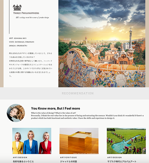
TP Service
 About
About
Principal in Strategic Design & Abstraction
 Consulting Service
Navigating the Leap in Product Management
 AI-Era Value:
Unrivaled Expertise
Business / UIUX
 Dieter Rams
10(→3+2) Principles for Good Design
 Theory
A Professional Perspective: the Golden Ratio
 UI Design
Four essntial steps of Micro Interactions
 Behavioral Economics
Utility:The Psychological Wallet and the Complexity of Product Growth
 PdM / CPO
Navigating the Core: The Evolution of a Product Designer
 UX Framework
The Pros and Cons of User Interviews
Art
 Marcel Duchamp
Marcel Duchamp And Modern Art
 Donald Judd
Minimalism and Abstraction
 Storm Thorgerson
Intentional Ambiguity
 Color Theory
The Boundless Potential of Color's Influence
Product
 King Sun & Pipistrello
An Elegant Table Lamp
 Danish Minimalism
Futuristic design that remains timeless.
 PH 4/3 lamp
Object's presence and its harmony with the space.
ArtDesignA Professional Perspective: the Golden Ratio
Composition - 2025 -
This page introduces the Golden Ratio—not as a mere list of rote-learned facts, but with a primary focus on cultivating your own aesthetic sensibility.
In design and art, before you communicate with others, it is vital to understand what you think and how you feel. I hope that by reflecting on these foundations and refining your sense of beauty, you will find the confidence to take that bold step forward without hesitation when the moment of decision arrives.
Note: In the latter half of this page, I will also discuss its implications for business. While this may feel somewhat redundant for those focused solely on improving their artistic expression, I invite you to relax and engage with the material whenever you have a moment to spare.
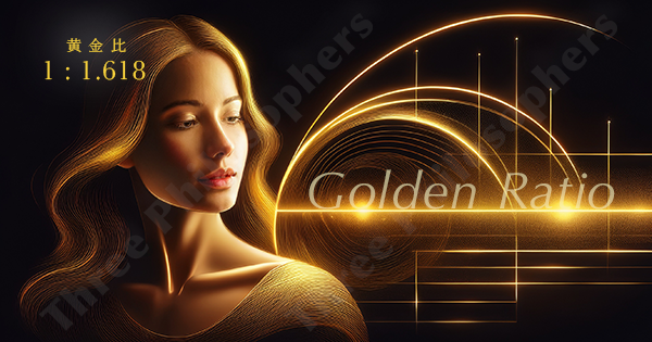
The Golden Ratio: The Ideal Proportion of 1 to 1.618
The Golden Ratio represents an ideal balance within a composition, perceived as perfectly harmonious by many—including the masters of expression. While aesthetic sensibilities and creative methods vary, this ratio stands as a "royal road" of proportion, frequently manifesting in the works of top-tier artists and designers throughout history.
In practical terms, as illustrated below, this translates to a ratio of approximately 5:8, or 1:1.618. Although the decimals continue infinitely, I will not delve into the mathematical complexities on this page. Countless websites and books explore the Golden Ratio; for those interested in the Fibonacci sequence and the world of science or mathematics, I encourage you to consult those various other resources.
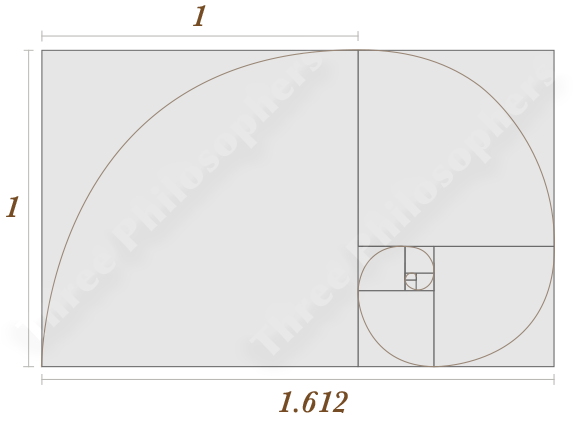
How does it strike you? Personally, looking at the diagram above, I feel an immediate sense of 'good proportion,' yet I understand that for some, it may not resonate at all.
Let me offer my conclusion first: in the practice of design, there is almost no need to overlay the generic 'Golden Ratio' templates commonly found on the web, nor should you feel compelled to reach for a calculator at every turn.
If you are determined to use it, I will not stop you. However, unless you are crafting a logo as part of a rigorous Corporate Identity (CI) system, I would not—as a supervisor—recommend that my team begin their creative process by being consciously tethered to the Golden Ratio.
Most websites explaining the Golden Ratio are remarkably similar and often quite forced—likely because they are simply quoting from other sources without a true understanding. Rather than half-heartedly stuffing your head with such information, focus first on self-refinement through practice.
By repeatedly navigating the cycle between composition and abstraction, you will naturally begin to grasp the proportions that resonate with an audience's sensibility. From there, it is enough to produce an output that genuinely reflects your own acquired skill—a design that, in every sense, is 'true to your own stature'.*
*Ultimately, design and art are dependent on one’s own innate capability. Imitation and plagiarism are unsustainable as a lifelong vocation. I have seen artists suffer precisely because they received accolades that exceeded their true caliber. The same holds true in business; I have seen almost no cases where a project—driven by a 'framework-insertion' approach, such as overlaying Golden Ratio templates—led to concrete, long-term success.
The ideal—indeed, the necessity—is that a work finished through your own genuine skill and intuition naturally manifests the Golden Ratio as a byproduct of its excellence.
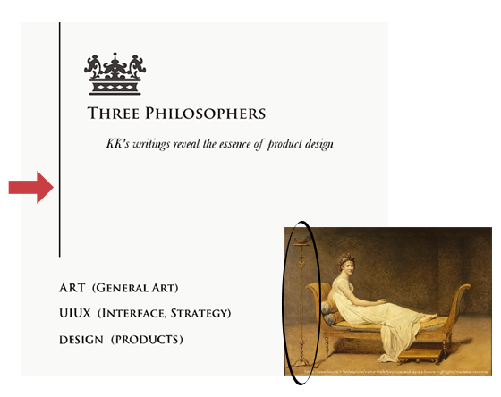
The Golden Ratio in Masterpieces
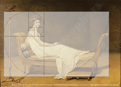
First, let us examine a work where the Golden Ratio can be clearly identified. Here, I have selected a piece by Jacques-Louis David, a central figure of Neoclassicism. David, along with Ingres, stands as a preeminent master of this era and category.
Note: I discuss Academism in more detail on the page dedicated to Marcel Duchamp. I have applied a unique structural approach to that page as well, so please take a look if you are interested. (Reference: Modern Art and Academism)
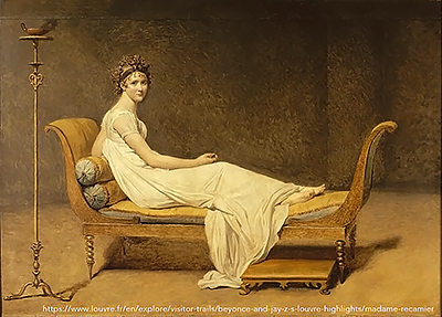
Madame Récamier - 1800 -
David has produced numerous spectacular and famous works, such as Bonaparte Crossing the Alps, but the composition of this piece is remarkably minimalist, making it the perfect sample for identifying the Golden Ratio.
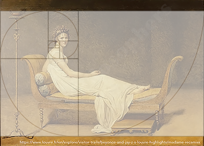
One might find certain functional oddities in the depiction of the candelabra or the daybed as furniture, but here, they serve primarily as essential compositional elements. Each part functions as a component of the Golden Ratio, working together to bring a disciplined tension to the entire canvas.
To speak of fundamentals: David, Ingres, and almost every renowned master share a core conviction in 'Constructivism'—the art of composition. While their styles may range from the figurative to the abstract, any creator who abandons composition, or fails to reach a certain level of mastery, is—to borrow a phrase from a famous manga—nothing more than a 'quack.'
Consequently, a masterpiece should, by definition, maintain perfect proportions no matter where you crop the frame. This is why the Golden Ratio remains valid even as we narrow the field of view, as shown below.
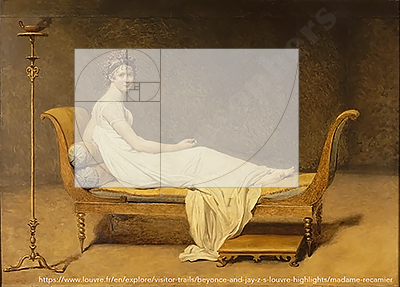
On my page regarding the color Yellow, I introduce a striking work by Edgar Degas. It is said that Degas was profoundly influenced by Ingres, even owning some of his works. In Degas’s paintings, as the level of figurative detail diminishes, the artist’s obsession with composition resonates even more powerfully with the viewer.
Degas did not consciously follow the Golden Ratio; rather, he grew up immersed in masterfully composed works, internalizing those principles until they became his own.
My message is not 'Apply the Golden Ratio everywhere,' but rather 'Internalize the sense of superior composition.' Ideally, this sensibility should be absorbed by the age of twenty.
If you rely on rote memorization, the creative spark to place a candelabra on the far left—as David did—will simply never occur to you.
The Golden Ratio in Typography
Examples of the Golden Ratio in masterpieces are by no means limited to the famous works of Da Vinci or Hokusai; they are infinite. If we expand our field of view to the relationships between minute details, we could likely discover tens of thousands of such instances.
With that in mind, let us turn to something more familiar. The Golden Ratio can also be identified in the Latin typefaces we use in design every day. I am sure everyone has, at some point, typed out a word using professional software.
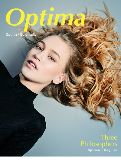
The typeface used for the title in the image above is Optima. It was designed by the legendary Hermann Zapf—whose extraordinary skill as a calligrapher famously saved him from being sent to the front lines during the war—inspired by ancient Italian inscriptions. Within the proportions of this typeface, the Golden Ratio is clearly present.
Can you discern exactly where it lies?
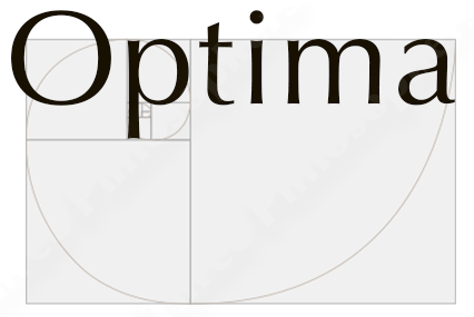
The answer: the ratio between the X-height and the distance from the baseline to the descender line forms the Golden Ratio. One truth to remember is that using a typeface with exceptional proportions elevates the design itself; when 'local optimization' is achieved in such details, the entire composition gains a disciplined tension.
Of course, not every typeface designed by Zapf is built upon the Golden Ratio. His body of work includes playful scripts like Zapfino, and among the enduring Western standard fonts, some echo the bustle of the city or the hum of a factory motor. What matters most is how the creator themselves perceives that form and those proportions.
Optima, our example here, was not created through mere imitation. First, the designer drew inspiration from the finest traditions and historical artifacts, but ultimately, he brought it to completion by relying on the refined sensibility he had cultivated over a lifetime.
References: Akira Kobayashi’s book on fonts (Partial quotes)
The Golden Ratio in Web Design
As another familiar example, let us look at web pages. The desktop landing page of this very site embodies the Golden Ratio.
Since the site is responsive, those on mobile devices can view the desktop layout by rotating their screen horizontally.
In creating this design, I used absolutely no Golden Ratio templates or calculators, nor was I consciously following any 'mold.' All that existed was the desire to freely craft a landing page centered on themes of "Essence, Abstraction, Composition, and Art."
Now, observe the diagram below. It is, quite simply, a perfect fit. It borders on the artistic—or perhaps, dare I say, a stroke of divine genius. (Self-praise intended.)
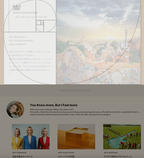
The most remarkable part is perhaps the vertical line extending in the upper left. In an era where web design has become monotonous and uniform, I drew this line on a whim—a touch of wit to assert individuality while maintaining overall control. Remarkably, it stops at the exact, ideal position.
I mentioned David’s candelabra earlier; I believe the intent and effect behind that single element are identical to the vertical line I drew on my landing page. As I state on my 'Expertise' page, this is precisely the strength I have forged through years of relentless self-refinement in the world of Abstract Expressionism—a realm of the highest caliber.
The Power of Abstract Expressionism: Years ago, while delivering a work to an exhibition, a young receptionist—likely an art student—was so overwhelmed by my piece that she seemed on the verge of fainting. The reason, I believe, lay in the sheer 'disparity of quality' between my work and the others being delivered. A genuine work of Abstract Expressionism is a continuous chain of total optimization—a relentless barrage of the Golden Ratio. Its impact is profound, resonating deeply with those who truly confront the essence of expression. For me, this was a formative experience, as vital as the wartime anecdote of Hermann Zapf.
The Golden Ratio: The Result of Total Optimization
Composition is a deceptively simple process: it is the art of handling each material—or rather, each piece of information—within the whole. Since the Golden Ratio is, fundamentally, a "ratio," its focus lies in relative performance. In the web design example, you have the logo, the links, the modal (the dynamic elements), the link text, and the body text. Placing each in its ideal spot requires a deliberate effort to make each element empower its neighbor, and by extension, the entire whole. As a result—whether by chance or miracle—it formed the Golden Ratio with staggering precision.
In my work as a design lead and consultant, I have observed that business environments share a striking similarity with art: if a project has two or three fundamental flaws, it usually requires a complete overhaul—addressing all ten out of ten issues.
The diagram below illustrates the information architecture (IA) and interface (UI) problems I identified in a certain product growth project. In this specific case, localized failures had accumulated to the point of threatening the overall functionality—the very essence of the business itself.
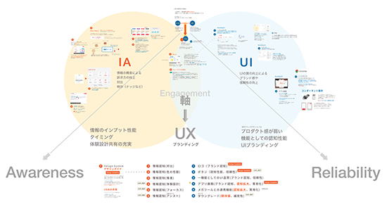
Just as with the difference between a masterpiece and the work of an amateur, it is almost impossible for a piece to be 90% perfect yet fundamentally broken in one specific area. You will never find a Mona Lisa where 'only the face' is poorly drawn. In the corporate example illustrated above, the same qualitative flaws permeated every aspect—from interface design to information architecture—simply because they originated from the same supervisor.
Lest I drift too far from our main topic, I will conclude this point here: the Golden Ratio is not a starting template, but rather a final result that manifests through the relentless continuity of exceptional compositional power.
(Note: I have also shared detailed reflections on my experiences in product design, specifically regarding how I refined each of my skills. If this piques your interest, I invite you to explore the linked articles. For an example of how abstract layers function within a business context, please refer to the page on 'Mental Accounting'.)
Coda: Reflections on the Golden Ratio
We have now covered the essential foundations. Let us consolidate the key insights we have explored:
- Moving Beyond Templates: There is no need to overlay Golden Ratio templates (I would not recommend this to those I supervise).
- Internalizing Skill: Compositional mastery is naturally acquired through the repeated cycle of "Composition ↔ Abstraction" (though it requires a long-term commitment).
- Infinite Proportions: Masterpieces are saturated with the Golden Ratio; focus on the underlying essence rather than being fixated on a single point.
- Local to Global: Achieving optimization in minute details brings a disciplined tension to the entire whole.
- The Power of Rigor: Those who have forged their skills in fields demanding extreme precision possess a distinct strength (and I count myself among them).
- No Shortcuts: Both business and design are a relentless pursuit of total optimization.
From a UX perspective, I will conclude this chapter here. I plan to add or expand upon the Advanced-level content at a later date.


TP Service
About
Principal in Strategic Design & Abstraction
Consulting Service
Navigating the Leap in Product Management
AI-Era Value:
Unrivaled Expertise
Business / UIUX
Dieter Rams
10(→3+2) Principles for Good Design
Theory
A Professional Perspective: the Golden Ratio
UI Design
Four essntial steps of Micro Interactions
Behavioral Economics
Utility:The Psychological Wallet and the Complexity of Product Growth
PdM / CPO
Navigating the Core: The Evolution of a Product Designer
UX Framework
The Pros and Cons of User Interviews
Art
Marcel Duchamp
Marcel Duchamp And Modern Art
Donald Judd
Minimalism and Abstraction
Storm Thorgerson
Intentional Ambiguity
Color Theory
The Boundless Potential of Color's Influence
Product
King Sun & Pipistrello
An Elegant Table Lamp
Danish Minimalism
Futuristic design that remains timeless.
PH 4/3 lamp
Object's presence and its harmony with the space.