TP
 About
About
AI-Era Value:Unrivaled Expertise
 PdM / CPO
Navigating the Core: The Evolution of a Product Designer
Business / UIUX
 Dieter Rams
10(→3+2) Principles for Good Design
 Theory
A Professional Perspective: the Golden Ratio
 UI Design
Four essntial steps of Micro Interactions
 Behavioral Economics
Utility:The Psychological Wallet and the Complexity of Product Growth
 UX Framework
The Pros and Cons of User Interviews
Art
 Marcel Duchamp
Marcel Duchamp And Modern Art
 Donald Judd
Minimalism and Abstraction
 Storm Thorgerson
Intentional Ambiguity
Product
 King Sun Lamp
An Elegant Table Lamp in Newyork
 Beogram 4000c
Futuristic design that remains timeless.
 PH 4/3 lamp
Object's presence and its harmony with the space.

UX DesignUser InterfaceFour essntial steps of Micro Interaction
User Interface - 2025 -
When you first held that long-awaited smartphone in your hands—for me, it was the iPhone—what was the very first function you mastered? Personally, it took me a considerable amount of time before I finally learned how to toggle the silent switch.
In this section, I would like to begin by reflecting on a famous incident caused by the physical specification of the iPhone's mute switch. From there, using the framework of 'Micro-interactions,' I will delve into the optimization of fine-grained usability and user experience through four essential steps.
· The Pitfall of "Silent Mode": Default Settings and Specification Traps
· The Atomic Unit of Operation: Designing to Prevent Disaster
· A Familiar Case: The Alarm Toggle — What is Missing?
(1) Trigger: The Foundation of Every Action
What is a Trigger?
Manual Triggers
System Triggers
Trigger Design: Preparing for the 'If'
(2) Rules: The Logic of Interaction (The Specification)
What are Rules?
User-First Logic
The Ultimate Goal of Rules
(3) Feedback: Responding to the User (UI/UX and Response)
What is Feedback?
Defining Product Character through Feedback
The Power of Visual, Auditory, and Haptic Communication
(4) Loops and Modes: Designing for the "Wow!" Moment
What are Loops and Modes?
Long-term Experience and Philosophy
· Coda: The Harmony of Small Details
Destruction of the Sublime: When Micro-interactions Fail
In the opening of Dan Saffer’s Microinteractions (published by O’Reilly Media), a chilling incident at a classical concert is described.
It occurred during the finale of Mahler’s Symphony No. 9, performed by the New York Philharmonic. In the very front row, an elderly man’s iPhone began to ring—the high-pitched "Marimba" alarm tone piercing through the sublime atmosphere of the concert hall. In a rare and dramatic move, the conductor halted the performance to address the source of the noise. Yet, the alarm continued to wail, turning the audience’s collective fury toward the man in the front row.
Pitfall of "Silent Mode": Default Settings and Specification Traps
According to a musician friend, Mahler’s sublime compositions envelop not only the audience but the performers themselves in an unspeakable emotional depth, making them immensely popular. Yet, at the very climax of this transcendent experience, the "Marimba" tone rang out mercilessly.
One might wonder how much blame the man deserved, but the reality is that he had indeed engaged the silent switch. When we dissect the "specifications," the trap becomes clear: by default, iPhone alarms are designed to sound even when the device is set to silent. This man was a devoted classical music enthusiast, holding multiple memberships and often exasperated by others' coughing or ill-timed applause. Even for someone so meticulous, the "specification trap" proved inescapable.
This incident sparked heated debates—from the pros and cons of iPhone’s functionality to the inadequacy of venue announcements. Even Dan Saffer noted, "If the alarm didn't go off in silent mode, thousands of people would oversleep every morning." From a purely functional standpoint, having it ring was, perhaps, the "correct" specification.
The Atomic Unit of Operation: Designing to Prevent Disaster
After this lengthy introduction, we must ask: What kind of design is required to prevent such incidents? While few people purchase an iPhone solely for the tactile 'click' of its switches, toggling silent mode is a critical function that every user relies on. In design that prioritizes micro-interactions, we define these detailed operations as 'micro' (or 'mico') in contrast to the product as a 'macro' entity, striving to elevate the quality of each interface through responsiveness and clarity.
It is only natural that users will abandon a feature—or even the product itself—if they cannot familiarize themselves with specific interfaces, such as mysterious buttons or ambiguous gadgets. As evidenced by Chasm Theory, the percentage of early adopters eager to embrace new technology is remarkably small. Most people hesitate before a 'deep chasm'—not just a business hurdle, but a psychological wall of reluctance. Therefore, by infusing interfaces with simplicity and explicit responses, we must provide the necessary 'clues for initial adoption'—in other words, true approachability.
A Familiar Case: Toggling the Alarm
On the iPhone, even a simple action like toggling an alarm on or off has its own "idiosyncrasies."

For many users, performing a specific gesture like flicking the screen—with its confusing array of terms like flick, swipe, click, or slide—is not second nature. Even in my own experience, as shown in the diagram, I’ve encountered unintended behaviors when trying to switch it. (While a 'click' is technically the correct interaction, the visual nature of the flat interface intuitively prompts a 'swipe,' which mistakenly triggers the 'Delete' button.)

One wonders if a simpler design, like the one illustrated below, might suffice.

As we can see, the overall quality of a product, as well as the user's comprehension and "approachability"—which directly tie into satisfaction and peace of mind—depend heavily on the maturity of its micro-interaction design.
To have prevented the incident at the concert hall, an additional step of response or an alert would have been necessary. However, there is the matter of branding to consider. As Dan Saffer noted, I personally believe Apple’s design was not "at fault."
(Note: The Branding Constraint—Adding another physical button for the sake of clarity would have been difficult from a design and branding perspective. For Apple, the UI and interface of their products are directly synonymous with the brand itself. The original iPod, for instance, is a quintessential product that challenged the principle of being "explicit" and emerged victorious through its masterful experience design and branding.)
Now, let us examine the four steps of micro-interactions as defined in Dan Saffer’s work.
Trigger: The Foundation of Every Action

The trigger is the very foundation of any micro-interaction. It is the catalyst that ignites the entire system: starting with the trigger, the interaction follows a set of Rules (the specifications defined by the creator), provides Feedback, and, depending on the application, incorporates multiple Modes or repetitions (Loops).
Manual Triggers
Most micro-interactions are initiated by a user action, categorized as a 'Manual Trigger.' The power button on a television or the icons lined up on a smartphone’s home screen are classic examples of manual triggers designed for user operation.
As I noted earlier, from a branding perspective, adding more physical buttons to the iPhone was undesirable. However, had those buttons been added, each would have functioned as an additional manual trigger.
System Triggers
In contrast to manual triggers, there are cases where the system itself initiates the interaction—such as a weather app pushing a notification to a user's device. These are categorized as System Triggers.
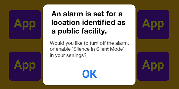
Although it would involve complex rule-setting, if Location Services had been integrated into the micro-interaction to fire a system trigger at the appropriate moment, the "Alarm Incident" might have remained a mere "attempted" disaster.
As we can see, staying conscious of these invisible triggers—bound tightly to intelligent rules—will be an invaluable asset in developing exceptional applications.
Trigger Design: Preparing for the 'If'

The image above illustrates the visual feedback in Windows 10 (JPN Ver.) that appears prominently on the screen when toggling the keyboard to half-width alphanumeric mode. Since Mac keyboards feature two distinct triggers—"Alphanumeric" and "Kana"—Windows, which lags behind in intuitive key-entry operability, added this feature as a thoughtful consideration for the user.
As we can see, the design of the trigger is vital as it serves as the backbone of any micro-interaction. As development progresses, you may encounter situations where the only way to adapt is by modifying rules or feedback. Therefore, it is crucial to conduct user testing at an early stage to identify as many "What-if" scenarios as possible.
Rules: The Logic of Interaction (The Specification)

Once a micro-interaction is initiated by a trigger, it operates according to a set of Rules. In other words, rules are the Specifications.
If we were to focus specifically on preventing the "Alarm Incident" mentioned in the introduction, various rules could be established: for instance, using location data to temporarily disable alarm functions, or displaying a warning such as "The alarm will sound even in Silent Mode" when a user sets a time during specific afternoon hours. These are the strategic specifications that define the interaction.
Rules Should Be User-First
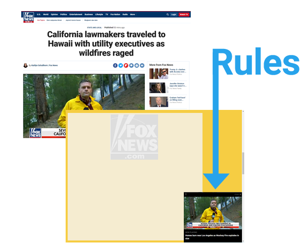
On Fox News, a video playing at the top of the page continues to follow you in the bottom-right corner even as you scroll down to read the article. This creates a very helpful impression for the reader. Such a specification is a prime example of a Rule within micro-interactions.
Ultimately, the purpose behind a rule is left to the intent of the creator. This is the crux of "Monozukuri"—the art of making things. The design must align with specific objectives: it is not merely about enhancing convenience; sometimes, it is strategically crafted to encourage conversions or drive user behavior.
The Ultimate Goal of Rules
In his book, Dan Saffer states: "The rules need to determine how the micro-interaction works in a way that someone who isn’t an expert can understand."
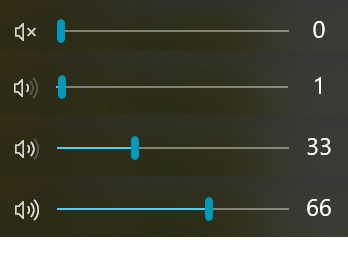
Even the seemingly simple Windows volume slider is packed with lessons on micro-interactions. First, the volume icon is displayed by default on the taskbar. Clicking that tiny icon serves as the Trigger, and as you adjust the volume via the slider, both the icon and the numbers change accordingly. The most critical factors in establishing Rules are accessibility and the provision of explicit feedback.
The 'Alarm Incident' might have been averted had a system trigger successfully communicated the underlying rules through explicit feedback. Rather than constructing logic from the ground up, the key to effective rule-making often lies in leveraging existing data—such as location services or login information—to create a more intelligent, context-aware experience.
In reality, while the patterns for rules are as vast as the number of applications themselves, our goal when complexity increases should be to integrate assistive functions that minimize the user's cognitive load. We want to reduce their choices as much as possible.
From a professional standpoint, user stress can be significantly mitigated through the strategic use of color palettes, button geometry, size, and both relative and absolute positioning. In my experience, I have identified specific tonal ranges that are uniquely suited for complex applications, and I have led projects that achieved high-level experience design by incorporating Fitts's Law into the structural layout.
By leveraging this multi-faceted knowledge, we can strive toward micro-interactions that offer the user a genuine sense of ease and comfort.
Feedback: Responding to the User (UI/UX and Response)

Once a micro-interaction is initiated by a trigger, the system provides Feedback to the user based on the underlying rules.
A toaster is a marvel of simplicity: you merely turn the timer knob to start the process. From there, the user can only watch as the bread gradually transforms into a golden-brown toast, accompanied by the steady tick-tock or humming sound. In this case, the physical transformation of the bread itself serves as the feedback—a truly revolutionary and intuitive mechanism.
However, within the realm of PC and smartphone applications, we do not have the luxury of such physical change. We must employ specific means to communicate progress and status; in other words, the feedback must be Explicit.

The psychological stress experienced during a page load, a download, or an installation varies significantly. Much like a slice of toast gradually browning, we must provide users with visual progress indicators tailored to each specific case. (Addressing the 'loading issue' is, arguably, one of the most critical challenges in business.)
While animations do not always yield positive results and must be used judiciously, they are remarkably effective when the user is in a state of 'enforced waiting'—as long as they do not hinder the core operation.
Furthermore, if you closely observe the toggles within the iPhone’s software, you will notice subtle bounces during transitions, accompanied by fading or morphing effects in the background. These natural, frictionless effects provide a sense of comfort in feedback and should be proactively integrated to enhance the user experience.
Feedback Defines the Product’s Character
In his writing, Dan Saffer states: "It is no exaggeration to say that feedback, along with the overall form of the product, is what defines its personality."
For a robust, high-end application, playful or pop-style animations would be jarringly out of place. It is essential to design visual effects that are concise, approachable, and harmonious with the product’s core identity, while paying meticulous attention to elements such as color theory.
The Communicative Power of Sight, Sound, and Touch
There are three primary sensory channels for delivering feedback:
· Visual (Sight)
· Auditory (Sound)
· Haptic (Touch / Vibration)
Among these, auditory feedback is processed by the brain more rapidly than visual information, making it the most direct and visceral form of communication. On iOS, a distinctive "ching" sound accompanies the completion of an in-app purchase. Personally, I find this to be an exceptionally effective piece of feedback.

Counter-intuitively, haptic feedback has a remarkably low transmission speed—often cited as being 100 times slower than auditory processing—which limits its practical applications. Indeed, many of us have missed an incoming email because a device’s vibration was too weak. To achieve true clarity, we must re-evaluate all channels of feedback—visual, auditory, and haptic—and refine them into a cohesive experience.
While feedback allows for a wide range of expression, it must always align with the product’s unique character. It is essential to integrate these sensory cues at precisely the right moment, carefully considering every possible context to ensure that the consistency of the micro-interaction, ignited by its trigger, remains unbroken.
Loops and Modes: Designing for the "Wow!" Moment

As micro-interactions become more complex, Modes become necessary to govern branching functionalities. For instance, the Shift key during keyboard entry is a mode designed to temporarily switch to uppercase characters. Behind the scenes, Loops serve to manage these modal functions and rules, acting as the framework that scales micro-interactions into larger, more cohesive applications.
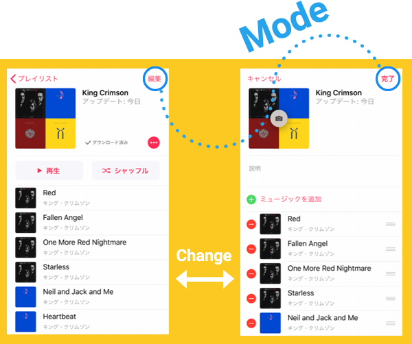
A clear example of a mode can be found in the iOS "Music" app. Tapping the "Edit" text in the upper right triggers a modal shift. This transition enables a different set of interactions: beyond simply adding or deleting tracks, the user can now rearrange the play order, edit descriptions, or change the cover photo.
On the other hand, competitors like Amazon Music employ a different type of micro-interaction—one that handles editing through screen transitions rather than modal shifts. Whether to opt for an irregular, 'off-pattern' interaction (like a mode) or a process with more linear steps is a strategic decision that rests entirely on the design's intent.
Loops, Long-term Experience, and Philosophy
There are two types of loops: those that directly intervene in the feedback process, and those that serve as pre-defined rules, commanding the system to act after a specific period. A classic example of the latter is the security specification of online banking, which automatically logs a user out after a period of inactivity.
In his work, Dan Saffer quotes the renowned architecture and design critic Deyan Sudjic: "When an object doesn't gain in value over time, then something is wrong with its design." This is a truly profound maxim.
Saffer also poses the question: "How can the second time a micro-interaction occurs be better than the first?" He introduces a design model known as "The Long Wow," pioneered by Brandon Schauer, former CEO of Adaptive Path—the pioneering UX consultancy acquired by Capital One in 2014. This model focuses on long-loop designs that cultivate a series of delightful experiences over an extended period of use.
Micro-interactions ignited by a trigger unfold according to their underlying rules. To maintain the 'momentum' of an application through feedback, it is vital to avoid unnecessary modal shifts that can diminish the sense of direct manipulation and flow.
Furthermore, as demonstrated by the 'Long Wow' model, there are design frameworks governed by loops that can yield near-limitless user experiences. Let us continue to pursue UI/UX design with passion, finding a sense of wonder in the world of experience that begins with the simple tap of an icon.
Coda: Four essntial steps of Micro Interaction
In this section, we have examined the significance of micro-interactions and their intricate steps.
To be frank, even tech giants—who establish and publish famous design guidelines—seem to struggle with these four steps and the essence of UI design; as seen in the iOS 'Music' app, which often becomes less intuitive with each update. To create an application that is clear, accessible, and highly functional, I encourage you to re-examine each of these steps from a multi-dimensional perspective—one that also accounts for the critical nuances of branding.