Color TheoryTriadMastering Color: The Triad Scheme
Color Scheme - 2025 -
Hello. Most likely, you are here because you are immersed in the study of color—perhaps aiming for a professional qualification or already working in a design-related field.
But what does it truly mean to have "mastered" color? At what level can one claim this mastery? Is it when you pass the top-tier color certification—in other words, when you have memorized the breadth of color theory? Or is it the moment you secure a position at a design firm?
The Boundless Potential of Color's Influence
Definitions may vary, and rightly so, but personally,
I believe we can only claim to have "mastered" color when one's application brings a screen or composition to life. In that respect, simply achieving the top-tier color certification is insufficient for true mastery.
In the field of design, I am keenly aware that qualifications—the knowledge required to attain them—and the actual demands of the job are fundamentally different.
The influence of color, much like business itself, holds boundless potential. Consequently, the quality of the resulting output varies immensely. The energy a piece emits is a direct and vivid manifestation of the creator's sense and skill. This holds true for a painting, a web design, or a simple household appliance.
The Triad Scheme

Now, let us explore the Triad scheme, which offers profound insights into the functional power of color. The Triad is a three-color composition. When the color wheel is divided into six segments, the lines connecting each hue form an equilateral triangle. We are all familiar with the blue, yellow, and red sequence used in traffic lights.
In musical terminology, a 'triad' refers to a three-note chord—such as the clear resonance of C major (C, E, G) or the distinct mood of D minor (D, F, A). Each possesses its own vivid clarity and expression. The effect in color is remarkably similar; the shift from a two-color to a three-color composition elevates the artistry to an entirely new dimension.
This diagram illustrates a standard equilateral triad scheme. A simple way to master this is to think of it as selecting colors from every other hue when the color wheel is divided into six segments. When the contrast is particularly striking, this is often referred to as a 'Tricolor' scheme.
Another well-known approach is the Split-Complementary scheme, where the lines connecting the hues form an isosceles triangle. This is created by splitting a single complementary color into two adjacent hues. It can be viewed as an evolution of the Dyad scheme. It is important to note that you are not strictly required to use both of the split colors; using only one to create a two-color composition is perfectly acceptable—though, in that case, it would no longer be classified as a Triad.
Similar to the Split-Complementary is the Compound scheme, where complementary colors are blended with adjacent hues within the color range. While this can result in a palette of four or more colors, the same flexibility applies to other schemes as well.
Determining Answers Through Data Analysis Fails to Reach the Underlying Principles.
On this site, I provide my own perspective on how colors are used and function in the masterpieces of great painters. To provide an explanation is to imply that the answer has been uncovered.
When an answer is known, it implies reproducibility.
Reproducibility is not about plagiarism or mere imitation; it means that the essential quality reveals itself consistently, regardless of how many times the process is repeated or what theme is applied.
It is said that Google once tested 41 shades of blue to identify the one with the highest click-through rate, resulting in a massive revenue boost. However, the conclusion was that they 'didn’t know why.' This means that if conditions change, they must start all over again. Such an approach lacks reproducibility and offers little value as a lasting legacy.
In the tech giant’s case, the answer lay in a purplish blue rather than a greenish one, relative to the six-part diagram above. By studying this site, you will gain an understanding of not only the inherent characteristics of colors but also the power of relativity. (Though, for those who simply lack the sensibility to see it, perhaps it’s wiser to stick with Google’s methodology.)
This phenomenon isn't exclusive to Google; it occurs in any environment where a certain amount of capital is involved. In my own experience, it wasn't blue, but yellow. The yellow adopted for a famous app had poor visibility and readability, leaving even the data scientists scratching their heads. Yet, in the business world, such cold, clinical operations are common.
Just as Google’s lead designer reportedly quit, fed up with an excessively data-driven environment, the "democratization of AI" will only accelerate this trend.
Consequently, value will lie in those who aren't biased toward either raw data or pure intuition in the future.
If a colleague suggests, 'Green had a high click-through rate before, so let's use green,' you should have the broad-mindedness to think it through with them, and the discernment to judge its true merit. Once you can confidently say, 'I understand the reasoning behind my decision, so it has more reproducibility than data analysis,' you will be nearing the level of a 'master' as mentioned at the start.
Now, to grasp this reproducibility for yourself, let us learn from the works of several great masters.
Triadic Schemes in Masterpieces: The Case of Umberto Boccioni
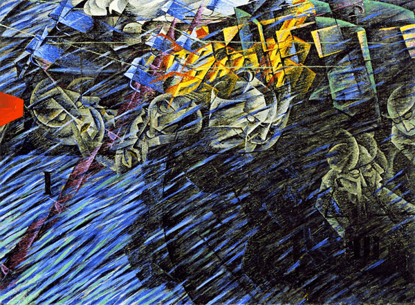
States of Mind II Those Who stay - 1912 -
In this work by Boccioni, a central figure of Italian Futurism, the contrast between the small touch of red on the left, the dominant blue of the left half, and the yellow in the upper center is striking. While there is a significant presence of the secondary colors—green, orange, and violet—the expressive green seems to occupy a position of lower dominance, as if being tossed about by the blue and yellow (symbols of the era and civilization).
Alternatively, one could interpret the function of the red-blue-yellow triad as a strategic anchor, preventing the composition from becoming overly heavy or stagnant through its vibrant functional balance.
Triadic Schemes in Masterpieces: The Case of Ernst Ludwig Kirchner
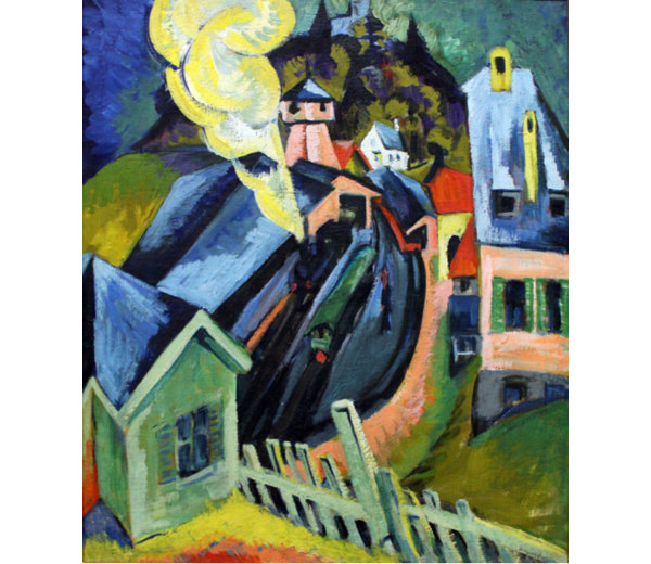
Koningstein Station - 1916 -
While Ernst Ludwig Kirchner is undeniably a titan of German art, his body of work suggests something far beyond calculated color schemes. Instead, one senses a profound purity—as if he were painting with the uninhibited heart of a child.
In this particular piece, he masterfully controls the overall balance by leveraging the vibrant contrast between red and yellow (positioned in the upper right and lower left). Despite being a cornerstone of German Expressionism, there is a certain 'pop' quality to his work, which is perhaps why his art remains so accessible and beloved by so many today.
Triadic Schemes in Masterpieces: The Case of Piet Mondrian
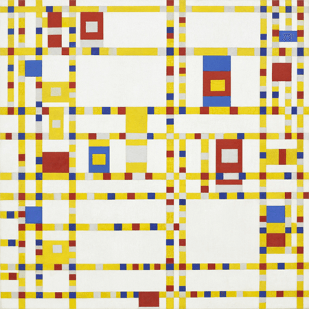
Broadway Boogie Woogie -1942-43 -
This is one of Mondrian’s final works, executed in a clear red, blue, and yellow triad scheme. Though hints of gray are subtly integrated upon closer inspection, the overall composition is a wonderfully rhythmic piece. While Mondrian also produced color-less works, it underscores a crucial point: the placement of each compositional element is paramount, and Mondrian excelled in this regard. His words were, "Toward the last victory"—to achieve such a positive brilliance in his final days is something any expressionist would aspire to.
Coda: The Power of Color, Relativity, and Composition

While the Triad scheme inherently creates a striking and cohesive impression, the works of Boccioni, Kirchner, and Mondrian demonstrate that the true strength of a design or artwork lies in its composition.
What these masters show us is that once a solid command of composition is established, one must also refine the use of secondary colors, such as green. The path to becoming a true master of color lies in the ability to manipulate the inherent power of individual hues while navigating the intricate relativity of their combinations.
